Today, I'll be looking at both the American and English versions of covers in Rachel Vincent's series, Soul Screamers. US on the left, UK on the right.


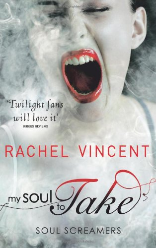
My Soul To Take (2009)
The red and black cover makes it seem a bit vampire-y, despite the book being about banshees. The UK cover raises questions as to why she's screaming, and the paler colour scheme makes it stand out. UK WIN. (Non-cover related note, the review, I thought I posted. I obviously didn't....Come back for that!)


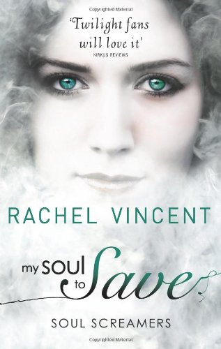
My Soul to Save (2009)
Both have a bluer emphasis, but the black and white "other colour" (I don't know what to call it!) remains clear. I don't really like the model in the US version. Maybe it's her, or maybe it's the photographer. I don't like it. DRAW


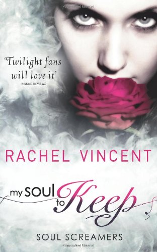
My Soul to Keep (2010)
I don't understand the use of the flower. Well, I haven't read the book, but as someone looking on it, I don't get it. US WIN


My Soul to Steal (2010)
The US cover just screams VAMPIRE! WHY? The smoky effects look good though. I also don't understand the use of the butterfly, but as I prefer butteflies to lowers, UK WIN.


If I Die (2011)
What happened to the title? Random change in titles...unless the rest of the series is If I *insert action*. Which, apparently it isn't. Right. I like the US version here, with a huge touch of magic coming from the girl. Oh, and it diverged from the formula of same accent colour... interesting. US WIN.
SERIES
I love the idea of keeping the accent colours the same throughout, but with a pale or dark main part. The US drew the prettier font, and the UK got the readable one. This one is definitely a well deserved draw.


I like the US covers better although I really like the UL If I Die cover.
ReplyDelete