Another cover feature. This time I'm going to post a lot of covers, then see if I can see any trends in the designs....shouldn't be that difficult, should it?
Picture Heavy

Twilight by Stephanie Meyer

Vampire Academy by Richelle Mead

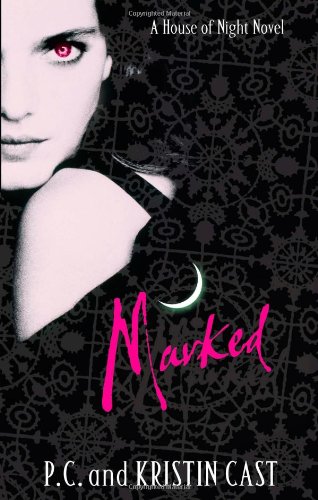
Marked by P.C and Kristin Cast

Glass Houses by Rachel Caine

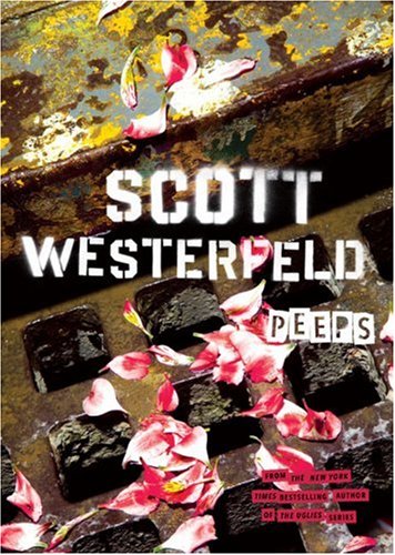
Peeps by Scott Westerfeld

Tantalize by Cynthia Leitich Smith

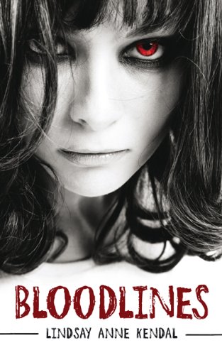
Bloodlines by Lindsay Anne Kendal

Evernight by Claudia Gray

Blue Bloods by Melissa de la Cruz

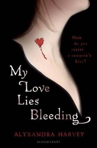
My Love Lies Bleeding by Alyxandra Harvey

Interview with the Vampire by Anne Rice

Vampire Kisses by Ellen Schreiber

Dracula by Bram Stoker

Carmilla by Joseph Sheridan le Fanu
So after that, what are we seeing?
Where's the difference...Glass Houses with the blue predominating it makes a change...(although there are editions falling back on the black background pale person formula).

Ah, how I missed your skulls and spots of tea, ah hem. Wisdom on books. ;)
ReplyDeleteStop by for a peak in to my disappearance to China!
Mad Scientist
Steampunkery & Book Reviews
Cool way to do a cover post. The blood theme is extremely big, yep. I have the new cover for Interview with The Vampire-- my favorite vamp book by far!-- and it features dripping red candles. So, more blood. Yay. :)
ReplyDelete@Mad Scientist I wondered where you'd gone...
ReplyDelete@Kat Blood is an obvious theme to go with...sometimes it works and sometimes it doesn't.... Your cover sounds awesome. Mine has Louis holding three candles in a chandelier, and black everywhere else. Boring. But it's the writing that counts . Of couse.