

But Cover to Cover is back. And like last time, it's books from a specific genre and compared. And it's fairies, a semi--common feature in YA. And because I've read absolutely none of these books, I can simply give my opinions on the covers and not be influenced by the book. And so, on to the feature...
((Picture heavy))
 Iron King by Julia Knight
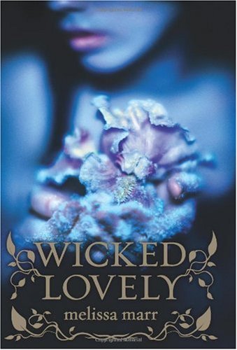 Wicked Lovely by Melissa Marr
 Tithe by Holly Black
 Lament by Maggie Stiefvater
 Wings by Aprilynne Pike
 Eyes Like Stars by Lisa Mantchev
 Glimmer Glass by Jenna Black
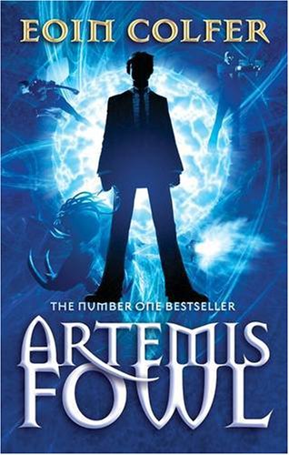 Artemis Fowl by Eoin Colfer
 Knife by R.J.Anderson
So, onto my comments and opinions. Blue seems to be the colour for the fae, the predominant colour in all of these. With exceptions. Iron King is more green, but in the series the colours rotate around to blue. Lament seems to follow Stiefvater's design scheme, which is nice. The Artemis Fowl seems to be breaking the mould with not having any wings or pretty girls on the front, which isn't that suprising considering how the fairies are used in this book.
What do you guys think?
No comments:
Post a Comment
Thanks for taking time to read this!
Comments are much loved.
Nina xxx